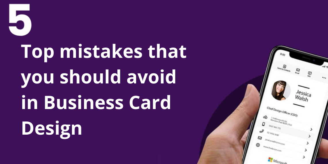
5 top mistakes that you should avoid in business card design
A business card plays an imp/ortant in building connections in the professional arena and is a powerful tool to make your potential client remember you. But the design of the business card plays an important role in making a virtual impression on the card. If your card isn’t impressive, your client may not consider you an option, and your card will become purposeless. So before sharing your card, you must spend plenty of time designing the card. You can now design your card yourself without professional help for FREE with Wyngs, the best digital visiting card design online. You will be able to design the card in just 2 minutes. But before that, let’s discuss the common mistakes.
1. Omitting contact information
Your business card is like a reminder for your client through which they can recall you and contact you. If your business is missing information like contact number, email, website, and address, you are losing many deals. So make sure you have presented all details. Many home-based businessmen hesitate in mentioning their address. Without an address, one may question your credibility. So always mention a physical address through which one can reach you. It may be a physical office, your home, or even a virtual office.
2. Design that matches with others
When many cards are lying on the desk, the card with unique design patterns always gets attention. So your card should be able to attract your client even in your absence.
3.Balance creativity with readability
Just now, we discussed the importance of experimenting with the card design. But at the same time, one should also maintain readability. Otherwise, it will become a curse for your business. The font and graphics should be decent to make people understand the information clearly.
4.Avoid cluttering
Excess of anything can make things worse. Don’t try to over-express with too much graphics and text. Your card should have a minimal design. Try to use icons wherever needed (in place of lengthy text). Also, the font size should not be too big or too tiny. Paper cards have limited space to exhibit your achievements, but you can overcome this challenge with a digital card. There won’t be any problem with the space, and you will be able to provide direct URLs of your portfolio for a live example.
5.Wrong colour combination
The other thing that can make a difference in the design of your card is the colour combination you are using. The colour should be able to complement the colour of your logo, and one can evaluate the efforts and creativity that you have poured into that card. So before finalizing the design, try as many colour combinations as possible with the text and the graphics.
So these were some common mistakes that can happen while designing your business card. You can automate your designing process with elegant and customizable templates with Wyngs. It is considered the best digital visiting card design online platform. Simply log in and create your card free within a few minutes. So try it yourself today.